Captive Portal Design
There are many settings on this page that allow you to make design edits for the captive portal. There is a simple demo on the page that opens. There are buttons such as “BackGround, Logo, Form Area, Button, Position” on the demo. Clicking on the buttons will open various form fields below. With these form fields, you can customize the design for yourself.
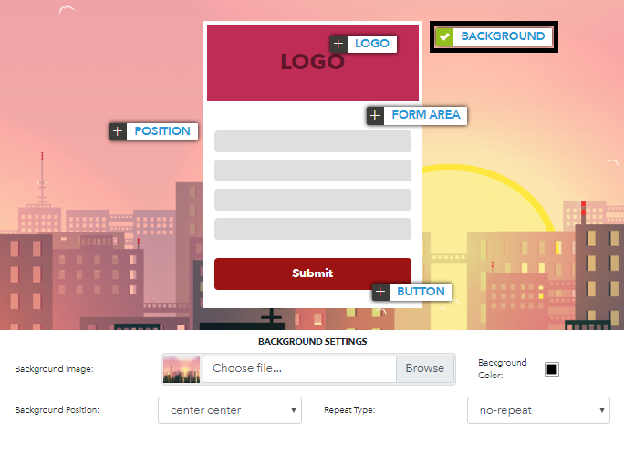
Background
It covers the necessary settings for the background of the captive portal.
- Background Image: It is the picture you want to make the background of your captive portal. It is not compulsory. A new image can be uploaded or the existing image can be removed. You can remove it from the drop-down menu when you hover the mouse over the thumbnail to remove it.
- Background Color: It determines the background color when the background image is not available.
- Background Position: Contains settings for positioning the Background image.
- Repeat Type: Arka plan görselinin ekrana tam sağladığı durumlarda geçerli ayarları içerir.
NOTE: When the Background Position is selected as "Center Center" and Repeat Type "Cover" is selected, the picture will be fully fit on the screen. {.is-info}

Logo
It contains the necessary settings for the logo on the captive portal.
- Logo: It is the picture you want to make the logo of your captive portal. It is not compulsory. A new image can be uploaded or the existing image can be removed. You can remove it from the drop-down menu when you hover the mouse over the thumbnail to remove it.

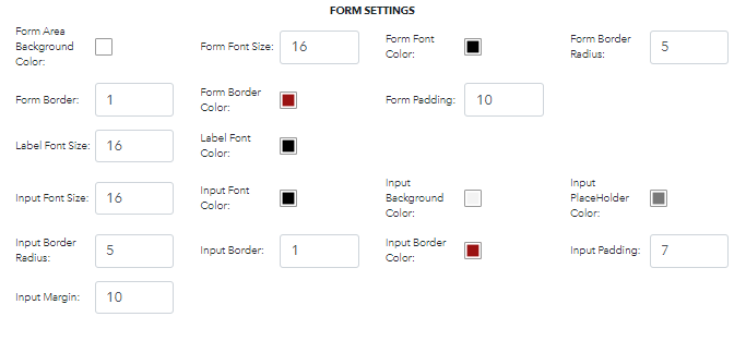
Form Area
It contains visual settings for form fields that users will verify.
- Form Area Background Color: Set the background color of the entire form area.
- Form Font Size: Set the font size of the entire form area.
- Form Font Color: Set the font color of the entire form area.
- Form Border Radius: Corners of an form area outer border edge.
- Form Border: Set the border size of the entire form area.
- Form Border Color: Set the border color of the entire form area.
- Form Padding: Set the internal space of the entire form area.
- Label Font Size: Sets the font size of the label in the form field.
- Label Font Color: Sets the font color of the label in the form field.
- Input Font Size: Sets the font size of the input in the form field.
- Input Font Color: Sets the font color of the input in the form field.
- Input Background Color: Sets the background color of the input in the form field.
- Input PlaceHolder Color: Sets the PlaceHolder color of the input in the form field.
- Input Border Radius: Sets the border radius of the input in the form field.
- Input Border: Sets the border size of the input in the form field.
- Input Border Color: Sets the border color of the input in the form field.
- Input Padding: Sets the internal space of the input in the form field.
- Input Margin: Sets the external space of the input in the form field.
Position
Change the position of the form on the page.
- Position: Set the placement of the form area on the page. There are three different types. Right, Left and Center.

Buton
It contains the visual settings of the buttons in the form field.
- Type: To select the appearance type of the Buttons in the form field.
- Font Size: Set the font size of the entire buttons in the form area.
- Font Color: Set the font color of the entire buttons in the form area.
- Background Color: Set the background color of the entire buttons in the form area.
- Border Radius: Set the border radius of the entire buttons in the form area.
- Border: Set the border size of the entire buttons in the form area.
- Border Color: Set the border color of the entire buttons in the form area.
- Padding: Set the internal space of the entire buttons in the form area.
- Margin: Set the external space of the entire buttons in the form area.
